
Stop Reaching for JavaScript: Modern HTML & CSS Interactive Patterns
Build popovers, modals, carousels, highlights, and scroll-driven effects with native HTML & CSS—fewer dependencies, better performance, and accessible by default.

Think “interaction” means “JavaScript”? Not anymore. The platform now ships powerful native features—<dialog>, the Popover API, CSS Anchor Positioning, Scroll Snap, ::target-text, :has(), light-dark(), native lazy-loading, scroll-driven animations, and more. Below is a practical, production-minded tour with tiny snippets, accessibility notes, official docs, and direct Can I Use links. I’ve also left image placeholders where you can drop support screenshots from caniuse.com.
Keep JS for data, business logic, and complex gestures. Reach for HTML/CSS first for structure and micro-interactions.
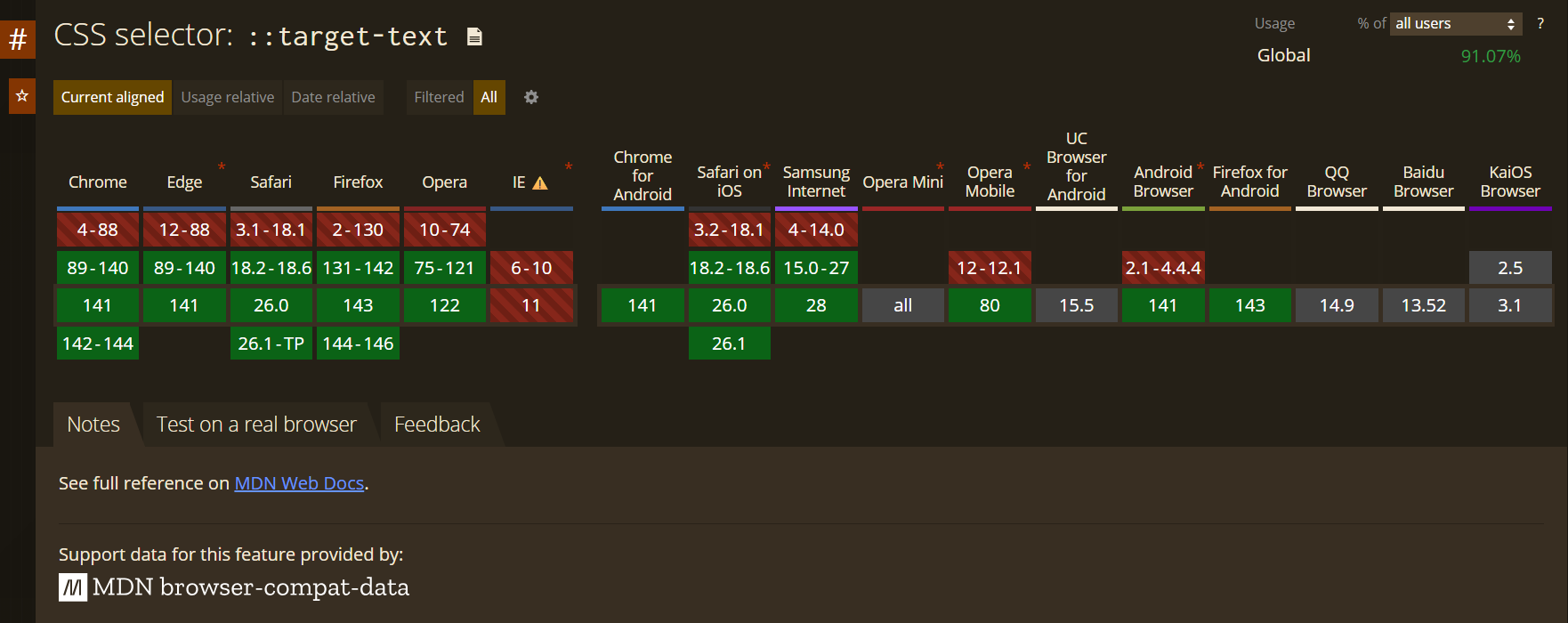
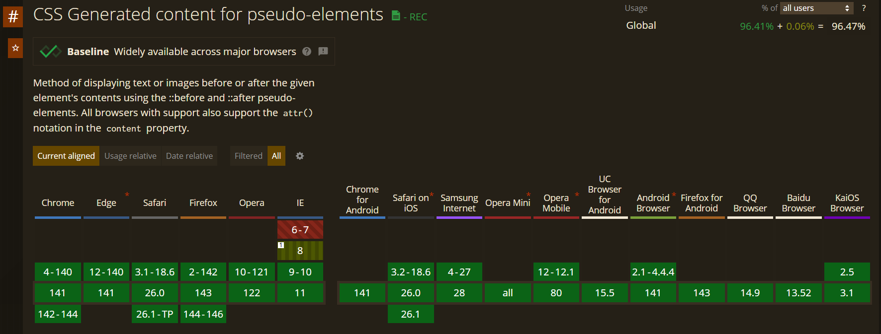
1) Deep-link and highlight text (Text Fragments)
Jump to and highlight a phrase—no JS.
<a href=”#:~:text=Highlighted%20text%20goes%20here”>Jump & highlight</a>
Style the highlight:
::target-text {
  background: mark;
  color: CanvasText;
  padding: .1em .2em;
  border-radius: .2em;
}
Docs:
MDN — Text fragments
https://developer.mozilla.org/en-US/docs/Web/URI/Reference/Fragment/Text_fragments
MDN —
::target-texthttps://developer.mozilla.org/en-US/docs/Web/CSS/::target-text
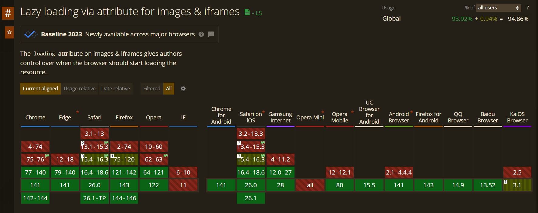
2) Instant gallery wins: native lazy-loading
<img loading=”lazy” src=”/photos/rome-01.jpg” width=”1200” height=”800” alt=”Trevi Fountain”>
<iframe loading=”lazy” src=”https://example.com/embed”></iframe>
Tip: set width/height to avoid CLS; use fetchpriority=”low” for heavy media.
Docs:
MDN — Lazy loading overview: https://developer.mozilla.org/docs/Web/Performance/Lazy_loading
MDN —
<img loading>: https://developer.mozilla.org/docs/Web/HTML/Element/img#loadingMDN —
<iframe loading>:
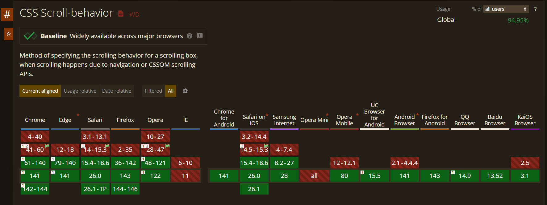
3) Anchor links that respect sticky headers
.section { scroll-margin-top: 72px; }
html { scroll-behavior: smooth; }
<a href=”#pricing”>See Pricing</a>
<section id=”pricing” class=”section”>...</section>
You can also use scroll-padding-top on the scrolling container.
Docs:
MDN —
scroll-margin:MDN —
scroll-padding:MDN —
scroll-behavior:
4) A tooltip with one element (no JS)
<button class=”tip” data-tip=”Copies the link”>Copy</button>
.tip{ position:relative; }
.tip::after{
  content: attr(data-tip);
  position:absolute;
  inset-block-end: calc(100% + 8px);
  inset-inline-start: 50%;
  translate: -50% 0;
  padding:.35em .55em;
  font-size:.85rem;
  background: color-mix(in hsl, CanvasText 85%, transparent);
  color: Canvas;
  border-radius:.4rem;
  opacity:0; pointer-events:none;
  transition: opacity .15s, translate .15s;
  white-space:nowrap;
}
.tip:hover::after,
.tip:focus-visible::after{ opacity:1; translate:-50% -2px; }
Docs:
MDN —
content: attr(): https://developer.mozilla.org/docs/Web/CSS/content#using_a_dom_attribute_as_the_contentMDN — Pseudo-elements:
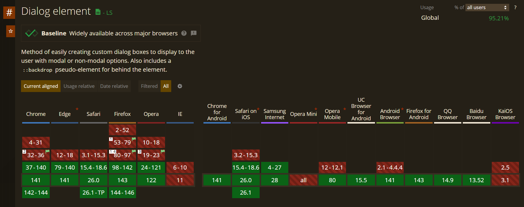
5) Accessible modals with <dialog>
<button id=”openDialog”>Open modal</button>
<dialog id=”modal”>
  <h2>Subscribe</h2>
  <p>No spam. Just monthly updates.</p>
  <form method=”dialog”>
    <button value=”cancel”>Cancel</button>
    <button value=”ok”>Continue</button>
  </form>
</dialog>
<script>
  modal.showModal = modal.showModal || modal.show; // simple fallback
  openDialog.addEventListener(’click’, () => modal.showModal());
</script>
Styling & animation:
dialog::backdrop{ background: rgb(0 0 0 / .45); }
@starting-style{ dialog[open]{ opacity:0; transform: translateY(24px); } }
dialog[open]{ transition: opacity .2s, transform .2s; opacity:1; transform:none; }
Docs:
MDN —
<dialog>:WHATWG HTML — dialog:
https://html.spec.whatwg.org/multipage/interactive-elements.html#the-dialog-element
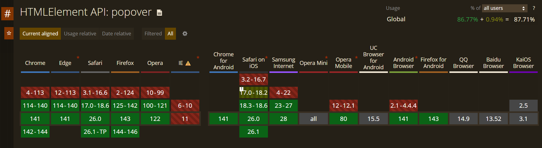
6) Popover API: menus, toasts, light overlays
<button popovertarget=”info”>Details</button>
<div id=”info” popover>
  <strong>Heads up:</strong> Beta feature
  <button popovertarget=”info” popovertargetaction=”hide”>Close</button>
</div>
Essentials: [popover], popovertarget, popovertargetaction=”show|hide|toggle”. You also get ::backdrop and :popover-open.
Docs:
MDN — Popover API:
Explainer:
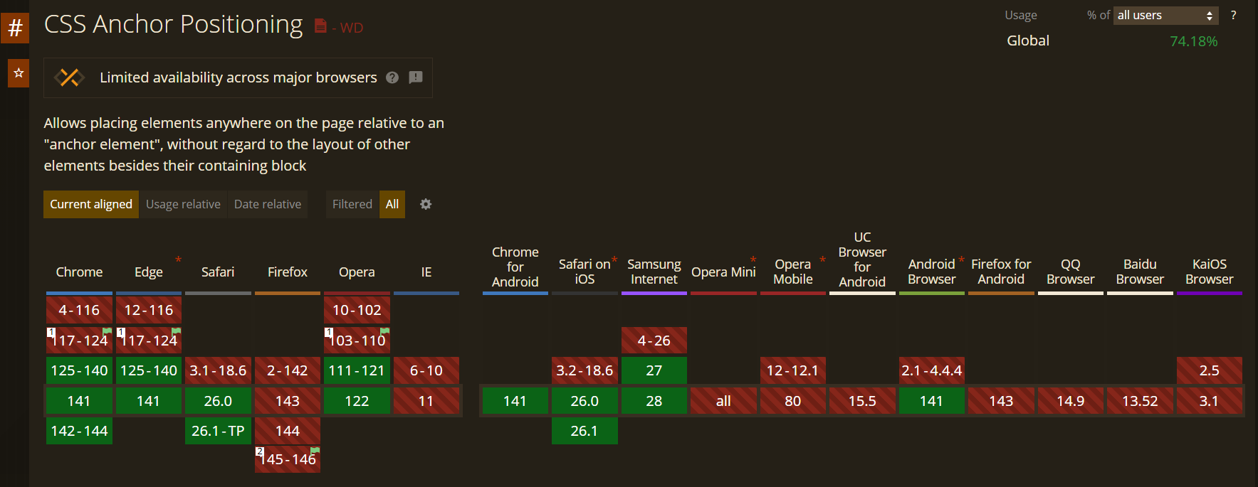
7) CSS Anchor Positioning: “position relative to that thing”
<button class=”trigger”>Open</button>
<div class=”panel” popover>Anchored panel</div>
.trigger { anchor-name: --btn; }
.panel {
  position: fixed;
  position-anchor: --btn;
  inset-block-start: anchor(bottom);
  inset-inline-start: anchor(center);
  translate: -50% 8px;
  min-inline-size: anchor-size(inline);
}
Docs:
MDN — CSS Anchor Positioning: https://developer.mozilla.org/docs/Web/CSS/CSS_Anchor_Positioning
Spec draft:
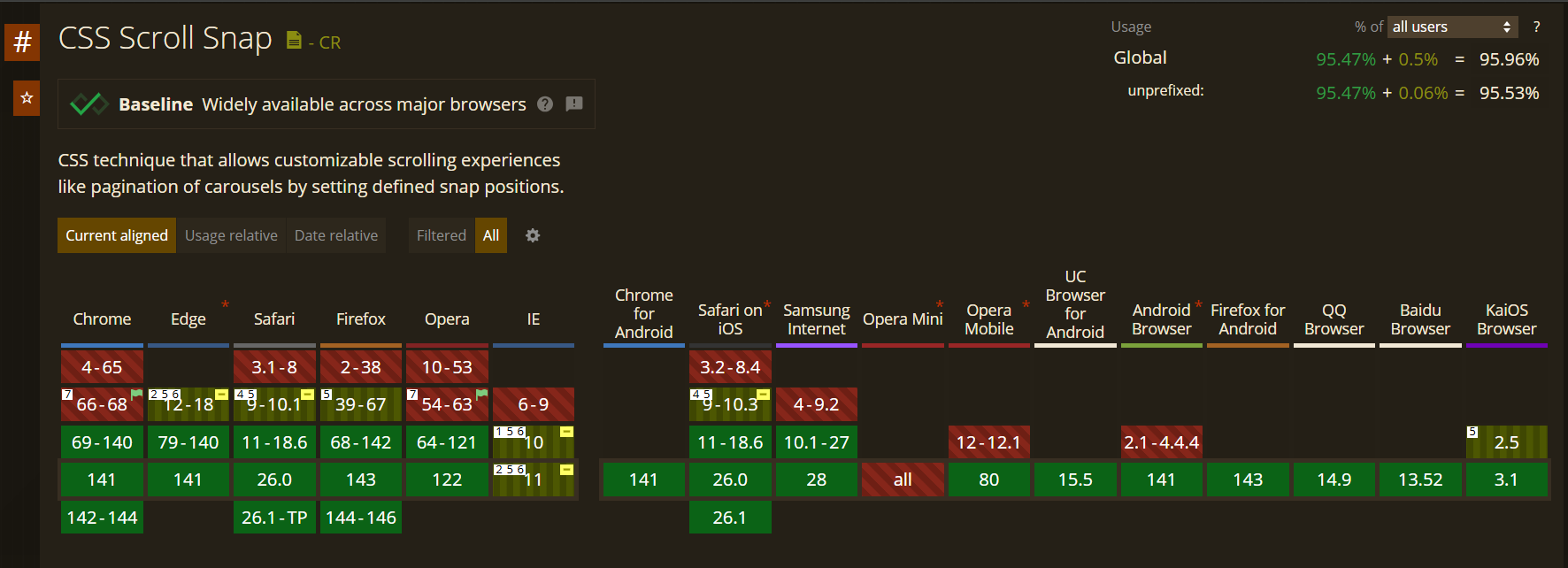
8) Lightweight carousel via CSS Scroll Snap
<div class=”carousel” aria-label=”Featured articles”>
  <article class=”card”>…</article>
  <article class=”card”>…</article>
  <article class=”card”>…</article>
</div>
.carousel{
  display:flex; gap:1rem; overflow:auto;
  scroll-snap-type: x mandatory;
  overscroll-behavior-x: contain;
  padding-inline:1rem;
}
.card{
  flex:0 0 320px;
  scroll-snap-align:start;
  scroll-snap-stop:always; /* optional */
  background:Canvas; color:CanvasText;
  border-radius:.75rem; padding:1rem;
  box-shadow:0 8px 24px rgb(0 0 0 / .08);
}
Docs:
MDN — Scroll Snap overview: https://developer.mozilla.org/docs/Web/CSS/CSS_scroll_snap
scroll-snap-type:scroll-snap-align:https://developer.mozilla.org/docs/Web/CSS/scroll-snap-align
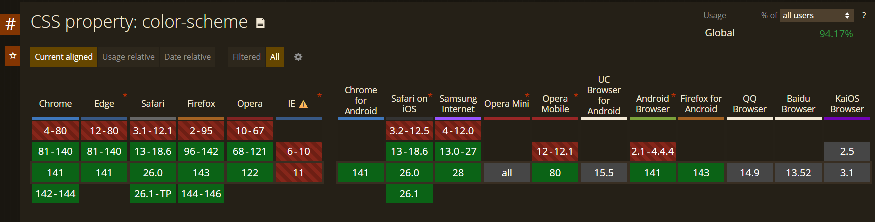
9) Light/Dark themes with light-dark() + color-scheme
:root{
  color-scheme: light dark;
  --bg: light-dark(#fff,#0b0b0c);
  --fg: light-dark(#0b0b0c,#f5f7fa);
  --muted: light-dark(#6b7280,#9aa4b2);
}
body{ background:var(--bg); color:var(--fg); }
A no-JS toggle (using :has()):
<label class=”theme-toggle”>
  <input type=”checkbox” id=”theme”>
  <span>Dark mode</span>
</label>
:root:has(#theme:checked){ color-scheme: dark light; }
Docs:
MDN —
light-dark(): https://developer.mozilla.org/docs/Web/CSS/color_value/light-darkMDN —
color-scheme:MDN —
:has():
Not every interaction warrants a framework. Browsers can do a lot already—often faster, more accessible, and easier to maintain. Experiment with these platform features and your UI will get lighter and friendlier.